Syllabus Tweaks

Hope everyone is having a good Spring Break! I’m looking forward to seeing you back in class in Monday.

This is just a quick note to point out that I have made a few tweaks to the syllabus. Some of the assignments were initially drafted with a much larger class enrollment in mind. Since we have a smaller group and have developed some more informal ways of working together, I’ve tried to adjust the syllabus accordingly.

I will talk more about these tweaks on Monday, but the most important changes are:

  • We won’t be using CATME to evaluate teamwork, but we will be using informal questionnaires that I will send you two times in the remaining weeks of the semester.
  • Rather than assigning each of you to only one small group, your small groups will shift shape depending on the tasks that need to be done each week.
  • Progress Reports will be written collaboratively and be assigned one grade for all students, but they will detail what each student in your group has done each week.

Enjoy the weekend, and don’t forget to set your clocks forward for Daylight Savings Time!

Slides from Tool Presentations

Thanks for the great job that you all did on your presentations about digital tools that might be helpful for our project with runaway slave ads! I’m posting here the slides that were shown in class so that we can reference them. Click the image to get the whole PDF.

First, Alyssa and Daniel talked with us about Voyant Tools:

Clare and Kaitlyn talked about using Google Maps and Google Fusion Tables, together with Social Explorer:

Thanks for sharing!

Group Presentation Schedule

  • Monday, 2pm: Alyssa and Daniel
  • Monday, 2:25pm: Aaron (and Franco)
  • Wednesday, 2pm: Clare and Kaitlyn

Meetings Tomorrow

Just a reminder that we will not have our regular class tomorrow. Instead, I will meet with each small group individually in my office (Humanities Building 330) at the time we agreed on yesterday.

Discovering Runaway Slave Ads

These last few days, Franco and I have been developing a way to detect runaway slave ads in images of 19th centuries newspapers. The Portal to Texas History has digitized copies of thousands of issues of Texas newspapers and is a source waiting to be explored for runaway slave ads. For example, a search for “runaway negro” in the full-text (OCR transcriptions) of their collection yields 7,159(!) results. Clearly, that number is too high to accommodate manual perusal of all possible matches.

Fugitive Slave IconThus, we have been thinking about ways to automate the process. Under the suggestion of Dr. McDaniel, we decided to use OpenCV, a popular open source computer vision library, to conduct object recognition for the classic runaway slave icon. You know, this one:

(In newspapers, from what I have seen, it usually appeared much smaller and simplified, as shown here).

OpenCV has a tool called Cascade Classifier Training that builds an XML file that can be used to detect objects. It requires a set of positive samples, images that contain the chosen object, and negative samples, images that do not contain the object but are of similar context. It works best with a large dataset of positive samples, and to generate that it provides a function called “createsamples” that takes an image and applies transformations to it, such as adjustments in intensity, rotations, color inversions, and more to make altered versions. Once the cascade has been trained, it can be used to efficiently detect and locate the desired object in other images.

So, the first order of business in preparing to do object recognition was to collect a set of runaway slave icons. I downloaded ~35 newspaper page images containing the icon and cropped the images to only contain the icon visible. The tutorials [1, 2, 3 ..others] I read suggested that for best results the positive images (images of the object to be detected) should all be the same aspect ratio. For simplicity, I made sure all my images were 60x64px.

Next I generated a set of negative (background) images that were from newspaper images that did not have the runaway icon. These had to be the same size as the positive images. I read that a large data set was especially needed for the negatives, so I wrote a simple script to crop newspaper page images into a series of individual 60×64 pics. For anyone curious, here’s a gist of the code. Sample background imageA typical image looked something like this.

Negative sample for training the HAAR cascadeAfter running the script on several images, I ended up with ~1600 negative images to use in training the cascade classifier. I supplemented that with some manually-cropped pics of common icons such as the one that appears to the left.

Next I used the find command in terminal to output text files containing a list of all the positive and all the negative images. Then, I created the “sample,” a binary file that contains all the positive images that is required by the cascade trainer (opencv_traincascade). Like I mentioned, usually in creating the sample, transforming settings are specified to multiply the amount of data available to train the cascade. I figured that the runaway icon would always appear upright, and I made sure my positive images set contained icons of varying clarity, so I just ran opencv_createsamples without any distortions.

Finally, I had all I needed to train the cascade. I ran the following command in Terminal:
opencv_traincascade -data classifier -vec samples/samples.vec -bg negatives.txt -numStages 6 -minHitRate 0.95 -numPos 27 -numNeg 1613 -w 60 -h 64 -precalcValBufSize 512 -precalcIdxBufSize 256

Opencv_traincascade is the program to be run. The value for data is the name of the folder to store the resulting cascade file in. The value for vec is the path to the samples vector file. The value for bg is the name of the file containing paths to each negative image. numStages I am not entirely sure so I just picked 6 since I didn’t want the training to run for days as others have experienced. minHitRate dictates the accuracy. numPos I still don’t quite understand, but I chose ~80% of the number of positive images to ensure no errors would result. numNeg is the number of negative images. Then there’s width, height, and some settings specifying how much RAM the program can hog up.

I had high hopes, but after 30 minutes of fans-blaring CPU use the program quit with the error, “Required leaf false alarm rate achieved. Branch training terminated.” I need to do more research to figure out why it didn’t work, but an initial search told me that the number of positive samples I used may not be enough. Joy..

Next Steps:

  • Play around with OpenCV some more to try to get a functional cascade. Maybe enlist the help of stackoverflow or reddit.
  • Rethink whether object recognition is the best way to maximize runaway slave ad discovery. While a lot of ads did use the icon, perhaps a larger number did not. For newspapers with digital transcriptions, text-based analysis would surely provide better results.
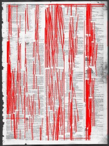
  • If we can’t get a working cascade to do object recognition, revisit newspaper decomposition. Franco and I tried using Hough Line Transforms through OpenCV to detect lines separating newspaper articles, but to no avail. Its promise is marked up images like the Sudoku board shown below. To the right of it is our “success.” The theory is that if we could detect the dividing lines in newspapers, we could crop the pages into individual articles, run OCR on each article, and then do text-analysis to discover runaway ads. It is no easy feat, though, as these [1, 2] research articles demonstrate.
  • I was able to improve our results by limiting detected lines to those with approximately horizontal or vertical slopes, since those are the only ones we are interested in newspapers, but it is clear we need to tweak the script or enlist a better system.

    Marked up Sudoku board using Hough Line Transform

    Sudoku hough line transform

    Hough Line Transform output

    Best we can do so far..

    If you have any tips or feedback, feel free to contact Franco (@FrancoBettati31) or me (@brawnstein) on Twitter, or leave a comment below. Thanks!

Parsing Newspaper Images

We are trying to parse newspaper images into discrete, smaller image components containing separate articles – which (unsurprisingly) is proving more difficult than we imagined. We are trying to use OpenCV to separate different articles from each other by identifying lines in the newspaper and using those lines to separate articles, but the line detection Hough Transformation program works very poorly on the input articles. We are now switching to finding the runaway slave icon in the text, which we are doing through image recognition software (HAR image detection) in OpenCV. We have not given up parsing documents by articles, though – which we are now considering parsing by image variation – detecting text from whitespace through pixel values, and then mapping text lines to find changes in text style corresponding to the end of one article and the beginning of another.

– Franco Bettati, Aaron Braunstein

Homework #5: Working with Google Maps, Google Earth, and “Time Map” Tools

Over the weekend, I completed the “Intro to Google Maps and Google Earth” tutorial from The Programming Historian. I learned how to import a dataset into a layer on Google Maps. The tutorial used data about UK Global Fat Supply from 1896, and through changing the style of the placemarks, I created a map that colors the placemarks by what kind of commodity that region provided.

Additionally, I learned how to create my own placemarks, lines, and polygons (enclosed areas or regions) on Google Maps. Knowing how to create these vector layers could be important for our project because many of our historical questions deal with geography, such as the difference between the slaveholders’ “geography of confinement” versus the slaves’ “rival geography” (for a full list of questions, see our previous post about historical questions).  However, it is more likely that we will be creating spreadsheets with the data that we will eventually want to use in a map, such as the location of the slave owner or the possible location the slave ran. Overall, Google Maps seems like a pretty simple tool for plotting locations or events. One of the main drawbacks of Google Maps, however, is that it can only import the first 100 rows of a dataset and only 3 datasets for a total of 300 features. It seems like we possibly have more data without narrowing the advertisements down than Google Maps can hold.

The tutorial also let me explore some of the features of Google Earth. Google Earth has the ability to create vector layers like in Google Maps, but it also has more advanced features such as the ability to upload a historical map to overlay over a section of Google Earth.

Map of Canada from 1815 overlayed on Google Earth

Google Earth has an interesting historical imagery view, which includes a sliding timeline bar that shows what a region looked like at a particular moment in time. Clare and I thought that we would be able to add placemarks with certain time stamps so that they only showed up at a certain point in time and then to animate the whole sequence. We tried valiantly to make it work, but the placemarks appeared regardless of which point in the timeline was selected on the timeline bar. At this point, without finding some sort of tutorial, I do not think we can go much further with animating placemarks on Google Earth.

We do think that being able to animate points in time would be useful for us to look at many of our historical questions. Neatline, a tool of the online exhibit creator Omeka, would give us the ability to do this. On Wednesday, I would like to take a closer look at what Neatline and TimeMapper (another tool for making “time maps”) do to see if either is something that we might want to pursue. In addition to looking at these time mapping tools during class, I want to look back over the tutorial on thematic data maps to better understand how Google Fusion Tables works. I think that these tools dealing with geography will potentially be useful in analyzing or presenting our data because of the focus on geography that many of our historical questions have.

Using Voyant Tools for Runaway Ads

I’ve been using the site Voyant Tools to look at the text content of runaway ads.
In a nutshell, the site pulls all the words, and finds their frequencies and trends.  It displays them in a variety of ways, which I’ll show with its analysis of 550 pages of Mississippi slave ads.

Without screenshots, you can view the results through this link (one feature is the enabled url and unique ID for data sets, which allows re-linking and comparing between documents).

Features include Cirrus- a basic word cloud, numerical data for the appearances of words in the corpus, the option to see each appearance in context, and Trends- a tool that visually maps out the relative frequency of the word throughout the course of the document.

This last tool is the most interesting to me, as in chronologically ordered ad sets, it gives you an immediate look at the relative usage of the term over time.  For example, the use of 1836 has one remarkable spike in usage over the course of several decades… We can use this to track usage of racial descriptive terms over time, or similar word-based information.

Through the incorporation of numerous corpuses of information, we can also compare word usage in different states and areas.  I can see how this will be helpful in the future in answering some of our questions regarding how Texas runaways and situations were different from those in the rest of the south.

Digital Mapping with Time Features

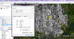
After completing the tutorials for the geographical digital tools, Kaitlyn and I decided that change across time was an essential element of a mapping tool for our project with runaway ads. Google Fusion, although interesting and relatively accessible as far as understanding, does not fulfill those needs. Our primary focus, then, has been on Google Earth. Enabling “Historical Imagery” under “View” creates a timeline with slider from 1943 to 2014 of the map imagery at a given time. Our next concern, then, was how we ourselves could insert time-specific data into Google Earth. In the “Properties” of a placemark under the “View” tab, there is an option under Date/Time for Time span and Time stamp.

We inserted two placemarks with different time spans in order to test the feature. Although the movement of the time slider seemed to acknowledge the fact that the span of years was between 1960 and 1965, the markers did not disappear when the time span was absent. Our primary problem, then, is in trouble-shooting this problem, since the feature itself seems to represent something we could use as far as time span data.

Andrew suggested a more computer-science based option through KML and the use of programming and coding in order to possibly diagnose the error. In addition, while searching for assistance with Google Earth time span, I discovered a digital humanities document from UCLA on the topic that seems like it could be of assistance. It seems to be relatively step-by-step but  my limited knowledge of programming has left me confused with how to work with this possible option.

Issues with Google Earth: it tends to crash or malfunction with relative frequency, which I have learned through previous path tracking work with it. For this reason, it would be more beneficial to find a tool that specializes in mapping over time, since the many features and possibilities are not necessary for our project and probably exacerbate the issue of frequent crashes.

One question that we would need to answer about our project is whether we want to map using regions or points. Regions would indicate frequency of runaways from a given area, or likelihood/projection of the owners on where their runaways have fled. A map of this sort would provide multiple layers of information about runaways: how likely they were to run away at a given time and how high runaway rates were in certain areas (if we wanted to focus solely on the latter question, we could probably use Google Fusion as our tool.)  A map with placemarks could easily become overcrowded with pinpoints. Although this problem could be solved through different color-coding techniques, any advantages of placemarks would be removed through getting rid of the specific location. Therefore, region-based mapping (around county, possibly?) seems to be the best option as far as runaway ads. Our data set would have to be examined in order to determine whether the information it provided would allow for such a system.

Today in class, we will possibly research the basic KML scripts that seem to be necessary for functioning of the Google Earth time span. With assistance, maybe we will be able to start working with the basic coding language using the steps from the UCLA document. We will also explore the timemapper option suggested by Dr. McDaniel over Twitter, in addition to neatline, a website that Kaitlyn was planning on exploring.  Once we determine whether or not these options are feasible for us, we will compare the possible time mapping tools and discuss their pros and cons in relationship to our particular topic of runaway slave ads and our specific data set.

HW#5: Thoughts and Progress on Voyant

For the group presentations, I’ve been working with the tool Voyant, which does text analysis on one or more documents. Among its tools, it generates a word cloud of most frequent words, generates graphs of word frequency across the corpus, and lets you compare multiple documents. Once you have a text uploaded, you can play around a lot within the Voyant “skin”, opening and closing different tools, or clicking on a particular word to see trends for that word specifically. It’s also possible to generate a link to the skin that can then be shared with others, allowing them to then play around with the data on their own. I think this interactive feature could potentially be really useful, since it lets anyone who is curious take a look at the data and track key words in pursuit of whatever questions they might be interested in.

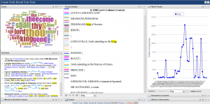
Just as an example of what using the Voyant tools looks like, this screenshot shows Shakespeare’s works (Voyant’s sample corpus).

Right now I have the word “king” selected, allowing me to see specific information about the word such as where in the corpus the word appears, frequencies of the word over time, and the word in context.

To apply Voyant specifically to runaway slave ads, Daniel and I looked at transcribed documents of runaway slave ads from Mississippi and Arkansas (PDF’s available from Documenting Runaway Slaves Project). I looked at the Arkansas ads, splitting the corpus up in two different ways. First, I split the document up by decade and then a single document of the ads from 1820-1865. (note: to turn off common stop words such as “and” “the”, click the gear icon and choose English for list of stop words) Splitting the ads up by decade could potentially make it easier to track changes over time, although since the original document was already ordered chronologically this is also possible to do with the single document. Another possibility we talked about in class is splitting up runaway ads into individual documents, making it possible to compare specific ads, rather than time clumps.

During class, Daniel and I combined the Arkansas and Mississippi documents to do a side-by-side comparison of the two states. Not surprisingly, “Arkansas” is a distinctive word in the Arkansas documents, but with other words such as “sheriff” or “committed” it could be interesting to dig down deeper and figure out why those differences exist. Are these merely linguistic/word choice differences, or do they indicate a difference in runaway patterns? These are the sorts of questions which Voyant raises, but can also help answer, with tools such as keywords in context.

I was interested in comparing the work we’d already done on Mississippi and Arkansas to some of the Texas ads we’ve collected in the Telegraph and Texas Register. I transcribed Texas ads from 1837 (excluding reprints) and compared that with Mississippi and Arkansas ads from 1837. The sample from Texas is small, so I would be hesitant to draw grand conclusions from this comparison, but it’s a good place to start addressing the questions many of us were interested in about what difference Texas makes (if any) in runaway patterns. Here are the results of all three states for 1837. Looking forward, I’m interested in looking at these results more closely to see if they raise interesting questions regarding Texas. This can help us answer questions about whether or not it’s worthwhile to continue transcribing Texas ads (and if so, how many), and how to split up the data (by year, by individual advertisement?).

The main downside to using Voyant so far is the same issue we ran into with Mallett: the Telegraph and Texas Register advertisements are not available individually in text format. This is not so much a limitation with Voyant itself as it is with the medium of primary source documents we are working with. It does seem at this point that Voyant could be a useful tool, but if we as a class decide to use Voyant for our project in the future, we’ll have to think of ways to get around that obstacle.